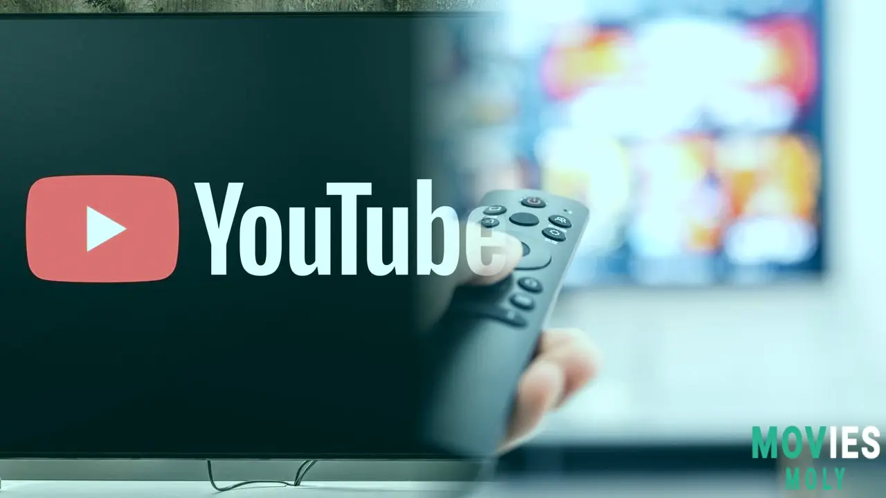
In the evolving battle for dominance on living room screens, YouTube just dropped a stealthy but powerful upgrade to its TV app. While not quite the full overhaul promised for later this year, the latest patch brings nine sharp UI improvements that transform the current experience from clunky to clever. For fans of YouTube on smart TVs and game consoles, this isn’t just an update—it’s an evolution in ease, speed, and savvy content consumption.
The new homescreen sections unlock faster access to what you really wantOne of the smartest moves in this update is the addition of new “shelves” on the YouTube home screen. These aren’t just cosmetic tweaks—they’re strategic shortcuts designed to cut down on controller gymnastics and make discovery instinctive. Among them, the “Continue your search” section stands out as a lifesaver. Anyone who’s wrestled with a TV remote to re-type a messy search string knows the pain here. By surfacing your top three recent searches, YouTube is giving users a fast lane back to their content quests.
Then there’s the “Listen again” shelf, which taps into YouTube’s massive role as a music streaming hub. Whether you’re replaying that one epic live guitar solo or just want your workout playlist on repeat, this feature feels personally attuned. And for the fan of underground gems and fan-made magic, the “Live performances, remixes and covers” section is pure YouTube gold—offering a curated doorway into the platform’s most vibrant audio ecosystem.

YouTube TV app adds a dedicated Shorts feed to the Subscriptions tab. It separates short-form videos from long content but forces Shorts to the top without an option to disable.
Primetime channels and top creators bring your subscriptions into sharp focus
Perhaps most intriguingly, YouTube has introduced a “Primetime channels” shelf that aggregates your subscription services like Paramount+, Showtime, and Starz into one streamlined strip. This move blurs the lines between YouTube’s core app and its YouTube TV service, hinting at a future where the two might integrate more seamlessly. For cord-cutters juggling multiple streaming apps, this could become a one-stop control center.
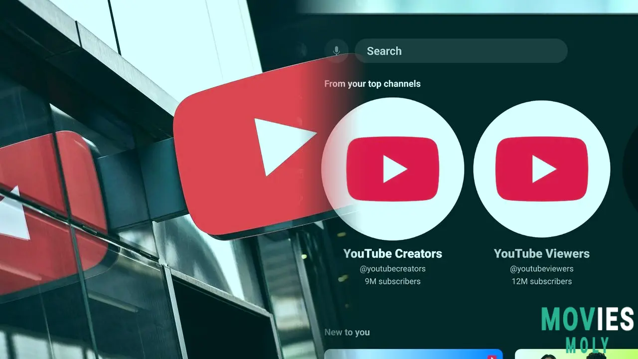
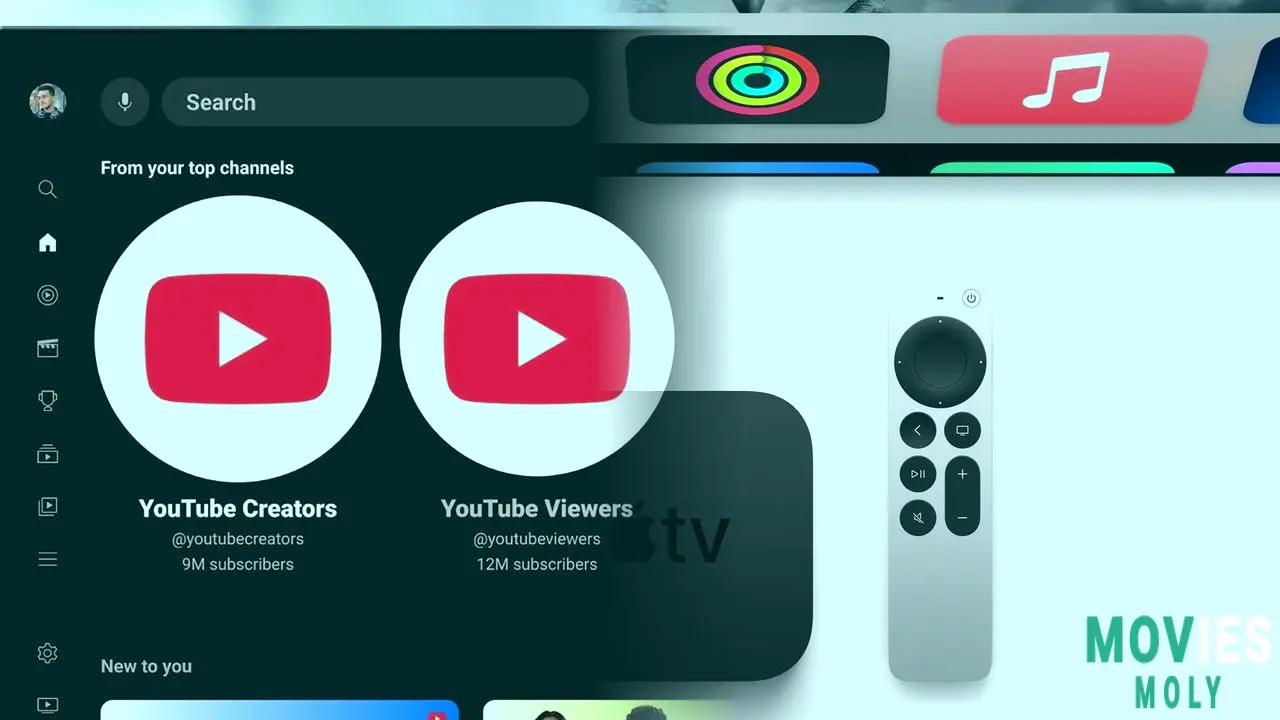
Complementing this is the “From your top channels” shelf, which smartly elevates your most-watched creators out of the chaotic subscriptions feed. It’s a small change with a big impact—giving superfans instant access to their favorite channels without the usual scrolling slog. This kind of user-focused design is what separates a good app from a game-changer.
Explore the latest updates to the YouTube TV app and essential tips for maintaining your smart TV's performance. Learn about new features cache clearing and picture setting optimization.
The dedicated Podcasts tab cements YouTube’s audio dominance
Audio enthusiasts, rejoice. YouTube’s new Podcasts tab is a clear play for ear-time supremacy. Having already overtaken Spotify and Apple Podcasts in U.S. podcast listener numbers, YouTube is now making it easier than ever to tune in from your couch. The dedicated space means no more hunting through video clutter for your latest episode—it’s podcasts, front and center, in a platform that most users never even thought to use for audio alone.

Big TV shake-up in Miami! Channel 7 WSVN is the new ABC affiliate after WPLG Local 10 and ABC part ways. Find out why and what it means for your favorite shows on MoviesMoly.
Shorts get a separate stage, and looping videos just leveled up
In another nod to content stratification, YouTube has separated its Shorts from longer videos. Now featuring a “Shorts Row” in the Watch Next feed and a dedicated Shorts section in Subscriptions, the platform is refining the viewing pipeline. Whether this means Shorts will be entirely absent from main subscription feeds remains to be seen—but for many, this cleanup will make the app feel far less cluttered and more purposeful.
And for those who love to binge, vibe, or study with videos on repeat, YouTube has unlocked the ability to loop individual on-demand videos. Previously only possible with playlists, this small but satisfying feature lets you stay in the zone without manual replay. It’s the kind of thoughtful addition that speaks to how well YouTube knows its user base.
YouTube TV's latest update unlocks multiview for non-sports content, a sleek TV app redesign, and powerful new features that revolutionize streaming.
Inline previews expand—but may spark debate among users
Rounding out the update are expanded inline previews—those hover-teaser clips that now appear on channel, subscription, and topic pages. These dynamic thumbnails add a Netflix-style flavor to browsing and could speed up decision-making. However, they may also divide opinion, with some viewers finding them distracting or data-heavy. Still, their inclusion underscores YouTube’s willingness to experiment with engagement tools on TV platforms.

The Boys showrunner Eric Kripke responds to Vought International's Homelander Super Bowl PR while season 4 ending hints at Billy Butcher's powers being short lived.
What this update means for the future of YouTube on TV
While these home screen upgrades are rolling out now, YouTube’s full redesign for TV—teased during its 20th birthday celebrations—is still on the horizon. Scheduled for release by the end of September, the overhaul promises even easier navigation, streamlined access to comments, and quicker ways to subscribe. Add in a planned “second screen experience” that lets viewers interact via smartphones, and YouTube is clearly building a multi-layered ecosystem for living room engagement.
For now, these incremental improvements are more than just stopgaps. They’re refining the core experience and setting the stage for a YouTube that doesn’t just live on your TV—but thrives there. In an era where streaming apps are fighting for attention with price hikes and feature bloat, YouTube is winning by sharpening what matters: user control, content discovery, and seamless interaction.
So grab your remote, clear your cache (seriously, do it), and get ready. YouTube’s TV app may not look like a superhero just yet, but with updates like these, it's quietly becoming the most powerful one in the room.